A product with an accompanying app that Helps you monitor your pet's water intake.
Aquatik
BACKGROUND
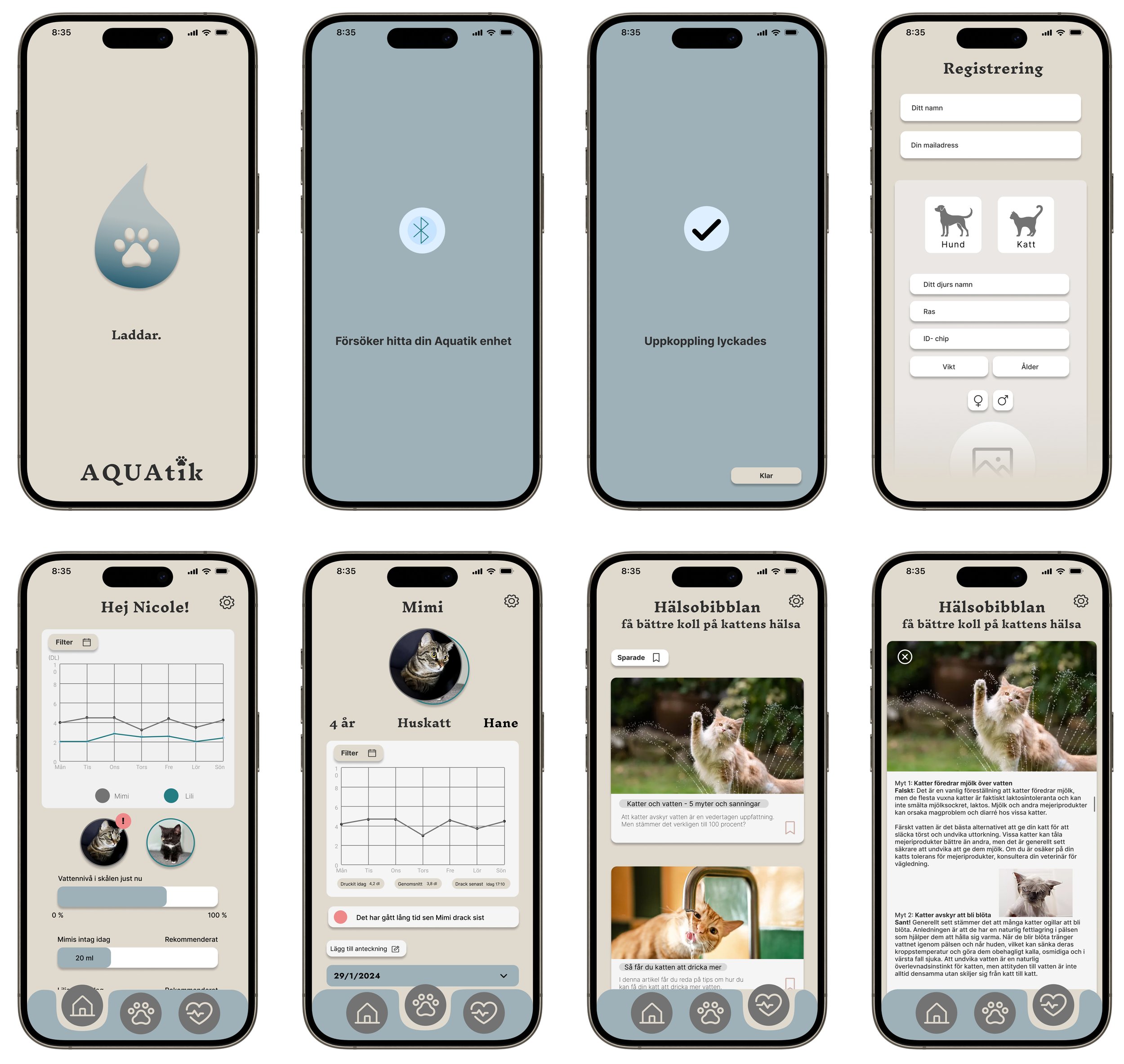
This project is a school assignment where we were tasked with creating a physical product along with a corresponding digital artifact. Our product is a physical mat with a built-in weighing system that provides data to an app. Through the app, the pet owner can keep track of their pet's water intake and other important information related to the water and the pet.
DETAILS
Team: 5 students
Role: UX/UI designer, UX researcher, Product designer
Duration: 2 Weeks
Tools: Figma, Miro, Canva
THE PROBLEM
Many pet owners struggle to effectively monitor their pet's water intake. Existing products in the market primarily focus on monitoring the pets food intake, neglecting the equally important aspect of water intake. This lack of adequate products for monitoring water intake results in a lack of awareness about the pet's hydration levels and can also affect the pet's well-being if certain symptoms related to water intake are not detected in time by the pet owner
THE SOLUTION
To address the problems mentioned above, we developed a physical product in the form of a mat with a built-in weighing system, combined with a mobile application. By integrating the weighing system into the mat, pet owners can easily get accurate data on their pet's water intake in real time via the accompanying app. This allows pet owners to monitor and analyze their pet's fluid intake in a convenient and informative way, thereby improving their pet's health and well-being.
USER RESEARCH
Quantitative Data: Surveys
We began by collecting 11 surveys using Google Forms, providing valuable insights into pet owners practices regarding monitoring their pet's water intake. The survey also contained some open-ended questions about what the pet owners use to maintain the pet's water intake at the moment and the type of water bowls the pet currently drinks from. Please note that this project was conducted in Swedish, and all questions asked were in Swedish. As a result, all responses included in this portfolio are translated from Swedish to English, which may affect sentence structure and understanding.
Qualitative Data: Interviews
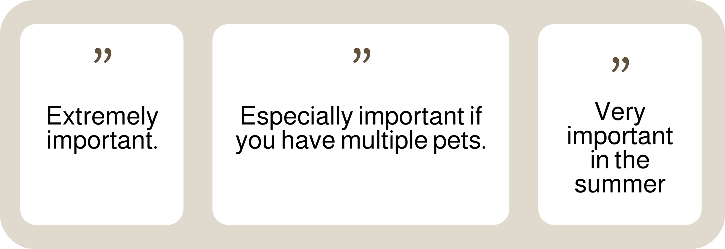
We interviewed 3 experts in the field to gather their opinions and perspectives on this topic. All three work at Sweden's largest pet store chains. Below are some of the questions asked during the interview along with their answers.
Question: How important is it for pet owners to keep track of their pet's water intake?
Question: Do you think there is a product missing in the market that makes it easier for pet owners to keep track of their pet's water intake?
Question: Is there anything relevant for us to discover or pay extra attention to regarding this topic?
THEMATIC ANALYSIS
The method begins with creating themes and codes for the qualitative data from the survey, thereby providing an overview of the themes that have emerged from the data. This gives a general insight into what the data actually consists of and illustrates the direction that the design process may take. This was done in Miro, where all the responses were written down on Post-it notes, duplicates were removed, and they were grouped by themes.
PERSONA
Based on the collected data, two distinct personas were created to represent the key user segments identified in the research. These personas represent the behaviors, needs, and challenges of the target audience, allowing for a deeper understanding of their motivations and preferences.
SCENARIO WITH A STORYBOARD
After the personas was created, the group developed a scenario and a storyboard to provide a more vivid and concrete picture of how the intended user interacts with the product. By using scenario and storyboard, the group was then able to deepen its understanding of how the persona would use the product and thereby create a more user-centered design.
Scenario
Storyboard
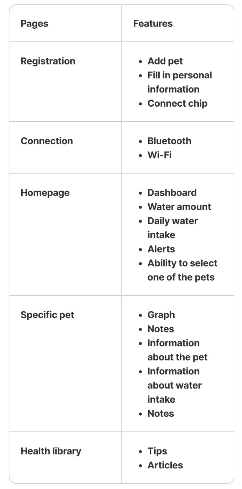
REQUIREMENT LIST
With the help of the collected data and the personas, the group began brainstorming ideas and created a requirements list of features and pages that should be included in the app.
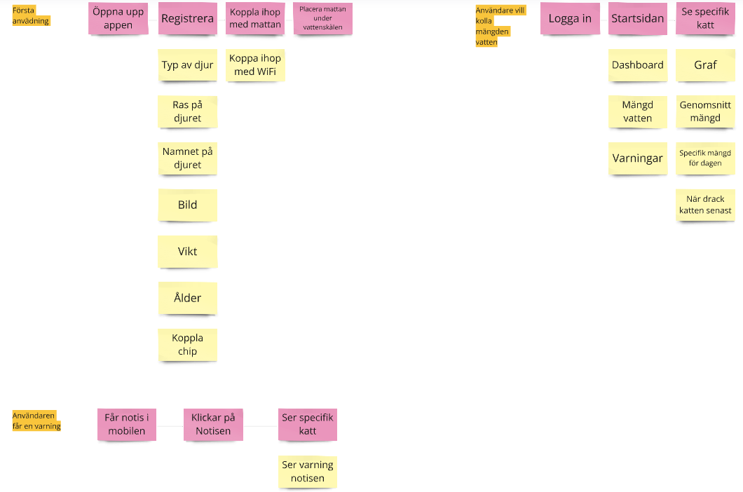
TASK FLOW
After the requirements list, a task flow was created based on different scenarios that shows the steps the user takes and what is available on each page the user accesses.
SKETCHES
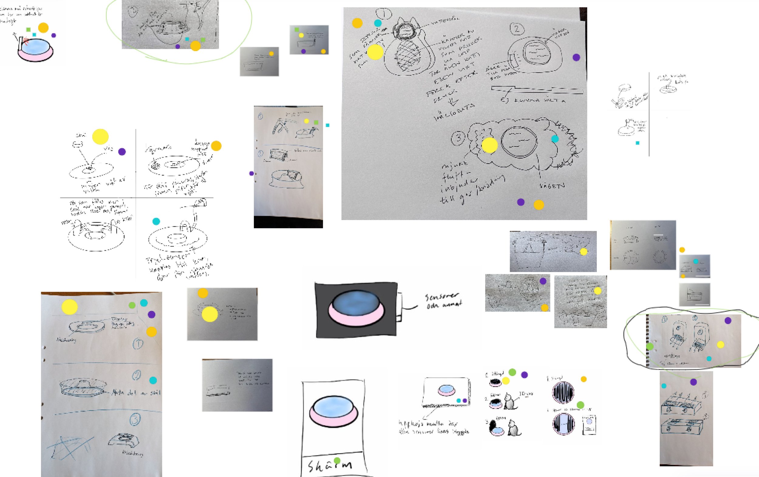
After identifying which pages and features should be included in the application, the sketching of the digital artifact (the application) began. Please note that the image below shows only a few of the many sketches that were created. In total, over 40 sketches were made.
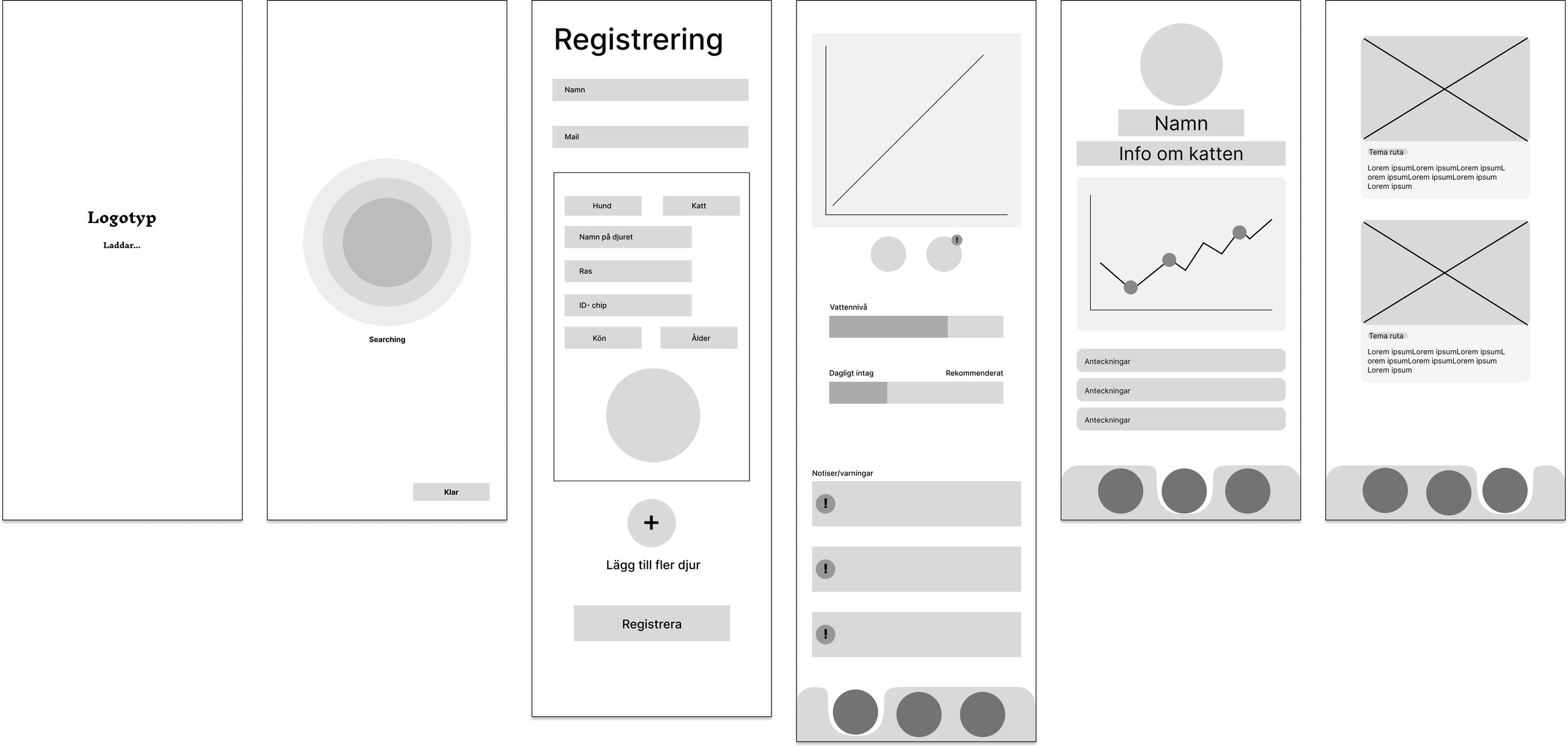
WIREFRAMES
After agreeing on which sketch the group wanted to proceed with, we began creating wireframes using the design tool Figma.
Brand Board
After creating the wireframes, we started considering which colors to use and developed the logo and brand identity.
MOCKUP
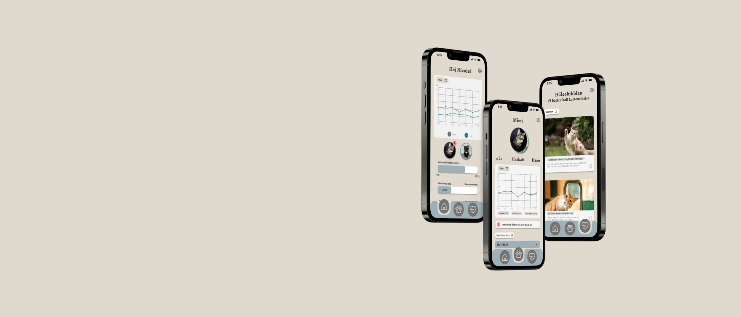
A mockup was developed to provide a visual representation of the final product, showcasing colors, icons to be used, the logo, and similar visual elements.
THE DIGITAL ARTIFACT
HEURISTIC EVALUATION
After completing the interactive prototype, a heuristic evaluation was conducted to identify issues with the design's user interface and to assess if the app meets the existing requirements. Here, we referred to the Nielsen Norman Group's “Jacob's Ten Usability Heuristics”.
Based on the evaluation above, the following changes were made:
A weight field was added to the registration page.
The icon for uploading a pet’s custom image on the registration page was changed.
The title on the homepage was changed from “Homepage “ to “Hello Nicole”.
It became easier to switch between pets.
A sorting function was added to the health library to allow users easy access to their saved articles.
SUMMATIVE TESTING
SUS - survey
After the heuristic evaluation, summative testing was conducted, where 3 users performed 5 scenarios and then responded to the SUS survey.
The 5 scenarios are as follows:
Access the graph showing how much the cats have consumed water over an entire month.
Find out how much “Mimi” has consumed today.
Discover what the warning notice indicates.
Open a note about a specific pet.
Bookmark an article.
After each completed scenario, users had the opportunity to share their experience, any difficulties encountered, and other feedback related to the scenario and the digital artifact.
Based on the results of the SUS survey, scores were then calculated to determine whether the digital artifact is considered usable by the users.
SUS - Score results
The result of user test 1 was 97.5, which according to the SUS scoring scale is the best possible outcome and results in an A.
The result of user test 2 was 75, which is good and acceptable, resulting in a B.
The result of user test 3 was 72.5, which indicates a good and acceptable score, resulting in a C
MOOD BOARD - PHYSICAL ARTIFACT
During the creation of the physical artifact, a mood board was created, which includes keywords, colors, shape inspiration and other elements related to the physical artifact.
SKETCHES - PHYSICAL ARTIFACT
The next step in creating the physical artifact was sketching, where the group sketched various ideas on how the product could look and function. We used the “Dot Voting” method to decide which sketches to move forward with. Each team member received five markers and voted for the ideas they liked the most. The sketches with the most votes were prioritized and chosen for further development.
THE PHYSICAL ARTIFACT
After reaching a final sketch result we liked, the creation of the final product began in the 3D program Blender. The physical artifact was created in various colors. Below are examples of the product in different appearances.
The product in white without water, shows the sensors in the bowl that measure the water
The product with a wood-like appearance filled with water.
The product in the color blue filled with water.
What we did well
In the this project, we worked well as a team and stayed focused on solving real problems for pet owners. Through surveys and interviews, we gathered useful insights that helped us design a solution based on actual needs. We created personas, scenarios, and task flows to guide our design process and ensure everything made sense for the users.
Our strength was combining the physical product with the app, making it both practical and easy to use. By testing the app with users and making improvements based on feedback, we created a solution that is simple, functional, and helpful for monitoring pets' water intake.
What I would do differently
If I were to work on this project again, I would start by conducting more in-depth user interviews to better understand the specific challenges pet owners face with tracking their pets' water intake.This would help us improve the app and make sure it solves the most important problems. I would also focus on making the prototype more interactive earlier in the process, so we could get more feedback from users before the final stages.This would help us identify usability issues sooner and make adjustments more effectively. Additionally, I would try out different design ideas for the physical artifact to make sure it fits better into various home environments.
